|
Sloane's
|
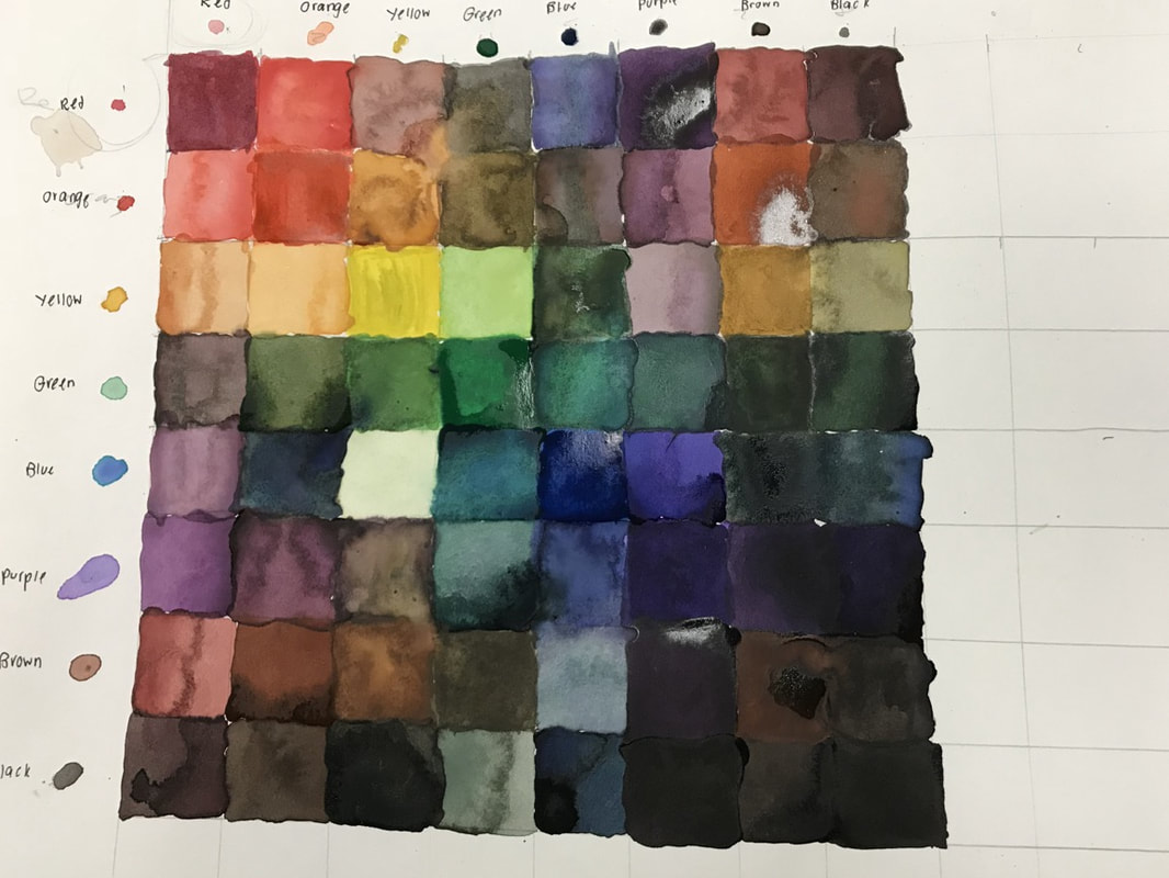 Since I injured my finger, I was unable to do the self portrait painting. I set up an 8x8 table with pencil and a ruler. The main art element that is present in this piece is color because when I mixed two colors together, I had to make sure that the color was blended correctly. The overall mood of this piece is happy because all the different colors are able to join together harmoniously.
0 Comments
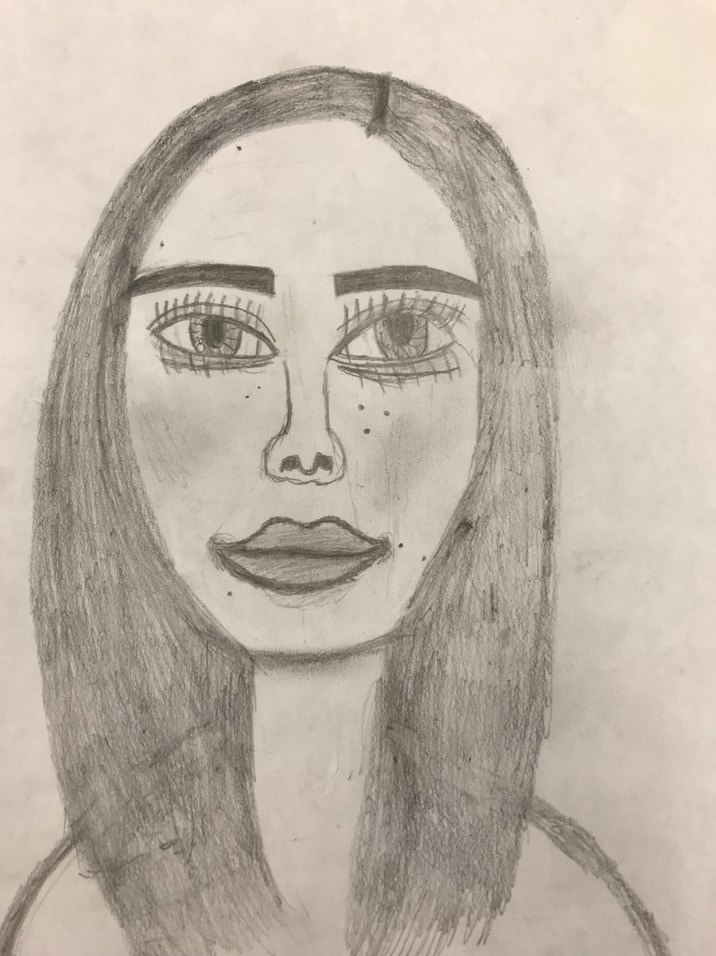 In my self portrait drawing, I used a pencil on a piece of paper to draw myself from a picture I took. To start this drawing off, I drew a guideline of the key features of the human face (eyes, nose, and mouth). Also, the face had to sit on what is referred to "the golden rectangle", which is an ideal proportion that frequently occurs throughout art. An art element that is present throughout this piece is shape. The different features on the face must be accentuated correctly or the drawing will not match the picture. Having form allows for the face to not look two dimensional by having certain areas stick out more. However, the most significant art element has to be scale and proportion. The difficult areas of the face were the features that had to be on proportion with the rest. They needed to be in the correct spots and also maintain the same size and shape.
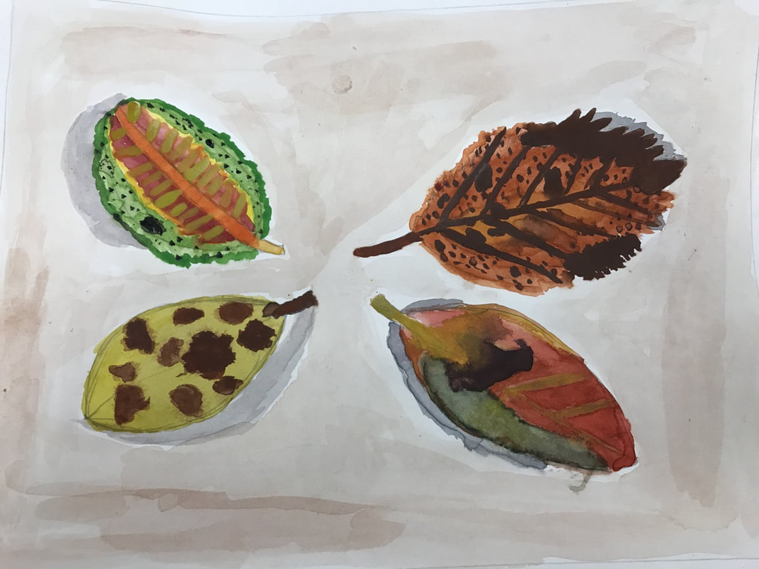 The purpose of this project was to use watercolors to layer leaves by using light to dark colors. I started off with basic shapes to set up my piece, and then went into specific details. to really show how the leaves look like. The skill I utilized was using watercolor paints to create the proper color and positioning of the leaves. The arts elements used in this painting were shape and texture. I used shape to show the proportion of the leaves, and I used texture by emphasizing the shape/balance of the leaves.
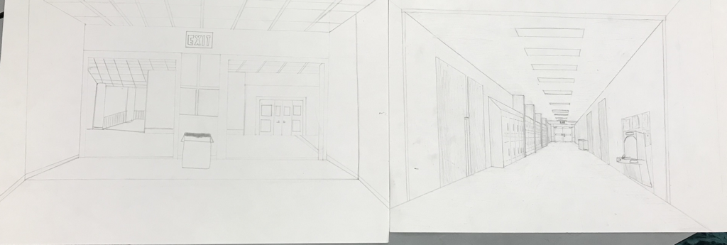 In this drawing, the purpose was to draw a hallway inside of the school and have it connect to the other people's in your group. The materials used were a pencil, eraser, ruler, and a drawing board. Once again, one point perspective was used in this drawing to show how all the lines connected to that specific point. By using value, the items in the foreground were darker and the ones in the background were lighter. The overall mood in this drawing was connectivity, because even though the hallways are completely different, everything is drawn to the vanishing point to show connectivity.
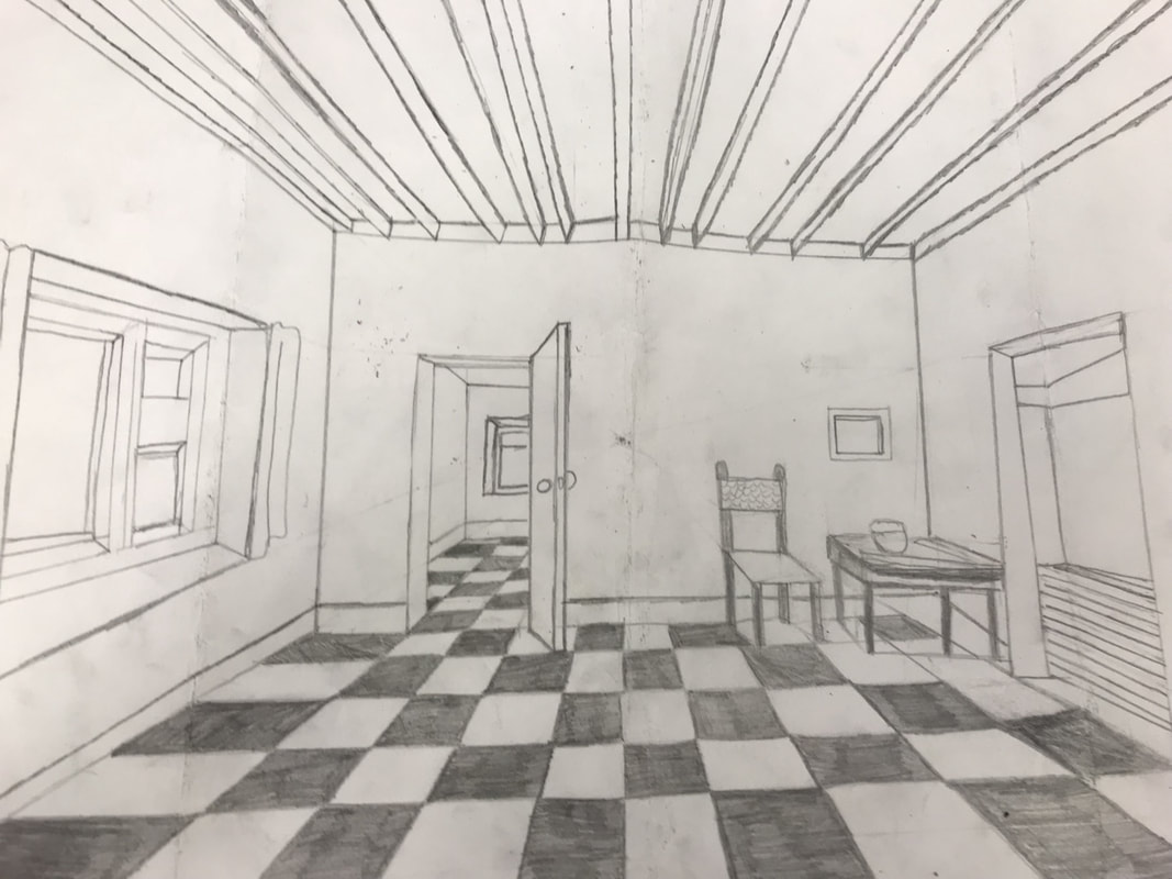 The drawing I created is of a room with a one point perspective to show how depth can be used. The material I utilized to create this drawing was a pencil because they allow the viewer to see contrasting line colors and to make them believe that they could walk straight back into the room. A vanishing point is when all of the lines connect to this point, allowing for the affect of depth. Proportion was also used, the objects closer to the viewer being larger and becoming gradually smaller the farther back the viewer looks.
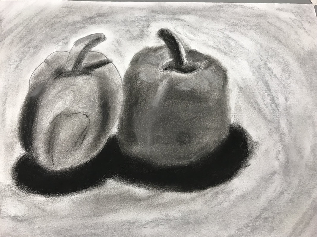 In the pepper value drawing, we used pastel on paper to create the peppers. The overall idea was to use different values to make the outline of the peppers. It was vital that to blend the lines made from pastels with our fingers rather then smudging the lines. Value was the most important art element in this piece because you needed to show a wide variety of value to create contrast. Lines were also just as important because by using the direction of a line, you were able to make the peppers more 3D.
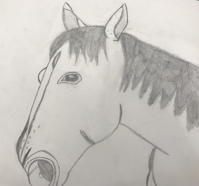 We finally got to choose an image that had different styles of lines, but it had to be approved by Mrs. Heideman first. I learned how to draw a horse realistically, and how to make all of my lines look straight enough. The art element in this piece included lines and creating shapes out of these lines. The overall mood of this piece is happiness and how to create it through lines.
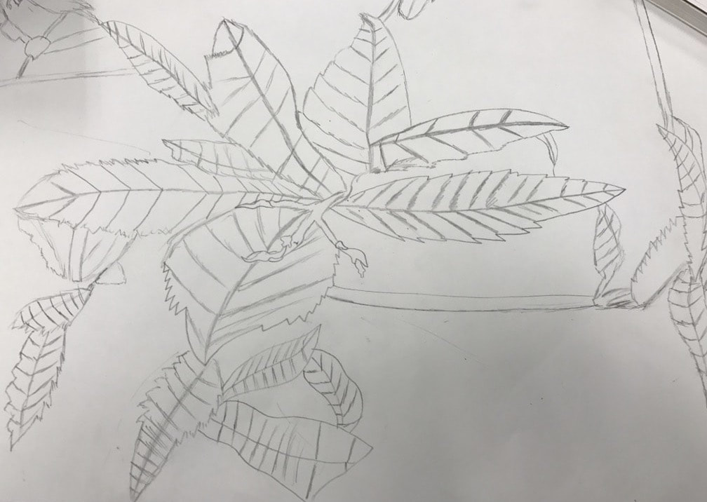 The purpose of this piece was to show how different levels of foliage were shown through lines. This means that at the starting level, the lines were darker. As you continued to draw out from the center, the lines eventually became lighter and not as close together. Also, the whole page should've been filled up because the image that I based this off of had every corner filled with leaves of some sorts.
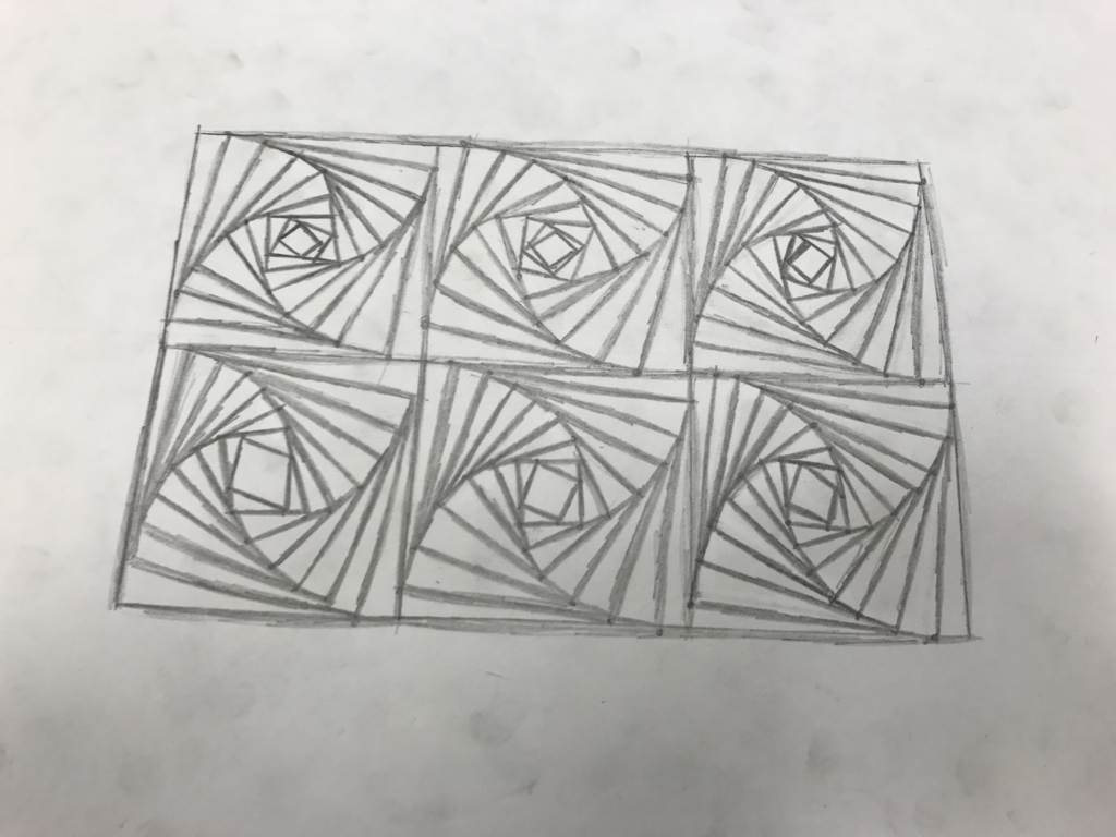 To start off art class, we made spiral squares in class that had to do with creating straight lines. The purpose of this assignment was to figure out how to draw these lines and how to keep a limited amount of space. We were supposed to find the proper balance between light and dark lines to create a sense of what space truly is. The materials in this assignment included a 2 HB pencil and a plain sheet of white paper.
|
AuthorWrite something about yourself. No need to be fancy, just an overview. ArchivesCategories |
 RSS Feed
